Pick - Enhancing the Rider Experience
What I did
Stakeholder
involved
Worked closely with stakeholders including the Founder, Engineers, Marketing, and Program Manager.
Overview
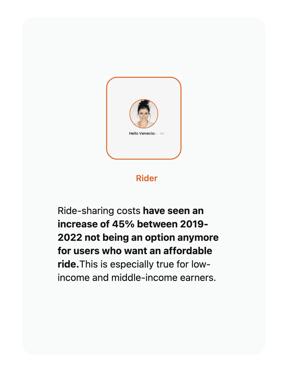
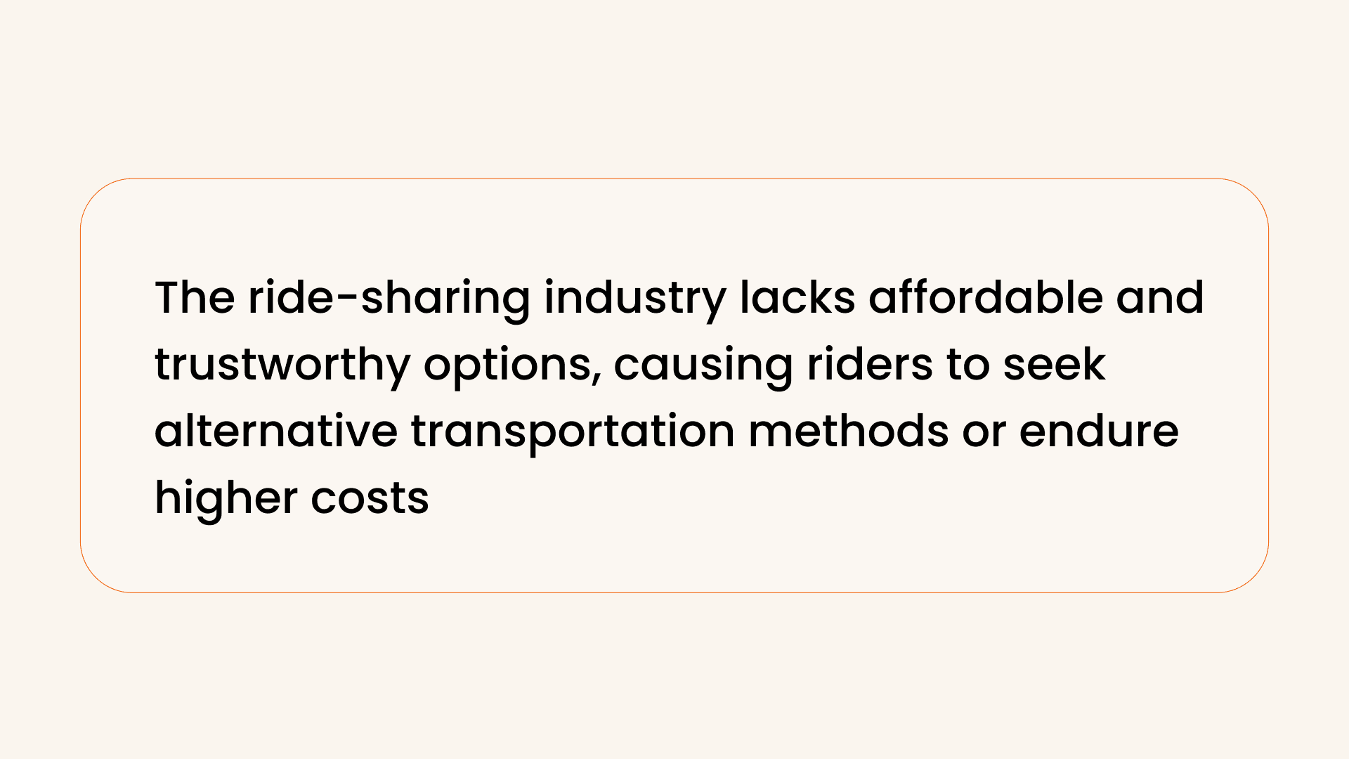
Pick App aimed to revolutionize the ride-hailing industry by addressing the concerns of both riders and drivers. Initial research revealed a growing need for affordability and trust within the industry.
Task
The challenge was to pinpoint usability gaps and investment areas for the new Pixel Tablet launch, considering diverse functionalities and user cases across Google's devices.
TL:DR
Project: Improving the Pick App's rider experience by addressing affordability and trust issues.
Research:
Conducted interviews and surveys to understand user pain points.
Observed industry trends and conducted competitive analysis.
Design & Ideation:
Developed 'Pick' and 'Ride Now' features to enhance user control.
Used Figma for low-fidelity wireframing and prioritized usability.
Testing & Iteration:
Conducted A/B testing to refine wireframe options.
Addressed usability issues identified in testing for improved user experience.
Outcome:
Achieved an 80% increase in user understanding and 10% improvement in usability.
Collaboration with cross-functional teams ensured cohesive efforts..
Enhanced Usability: Addressing usability issues through iterative testing led to a more intuitive and user-friendly interface. This improvement reduced user frustration and increased overall satisfaction
Tailored Solutions: Understanding user pain points through research allowed for the development of features like 'Pick Now,' catering to users who prioritize quick rides over cost.
Revenue Growth: The introduction of premium options like 'Pick Now' potentially increased revenue by offering users faster rides at a premium price
Positive Feedback and Reviews: Success metrics like an 80% increase in user understanding and improved feedback suggest that the changes were well-received
I Initiated Internal Interviews and Conducted Surveys for User Insights
I started with internal interviews with different colleagues that identified as the end users as a way to collect early insight and elaborate some hypotheses.
In Order to explore with a more diversified demographics group including Genz and Millennials. I decided to conducted a survey due to the ability to obtain a good amount of data that illustrates the market's needs.
I Conducted In-Field Observations to Identify User Pain Points and Competitive Pitfalls
I decided to conduct in-field observations to collect notes. It was crucial to identify user pain points beyond verbal communication. These insights allowed me to distinguish between the wants and needs of the users. It provided an opportunity to identify major competitive pitfalls, which became key focus points for delivering enhanced design solutions to the users and adding value to the business.
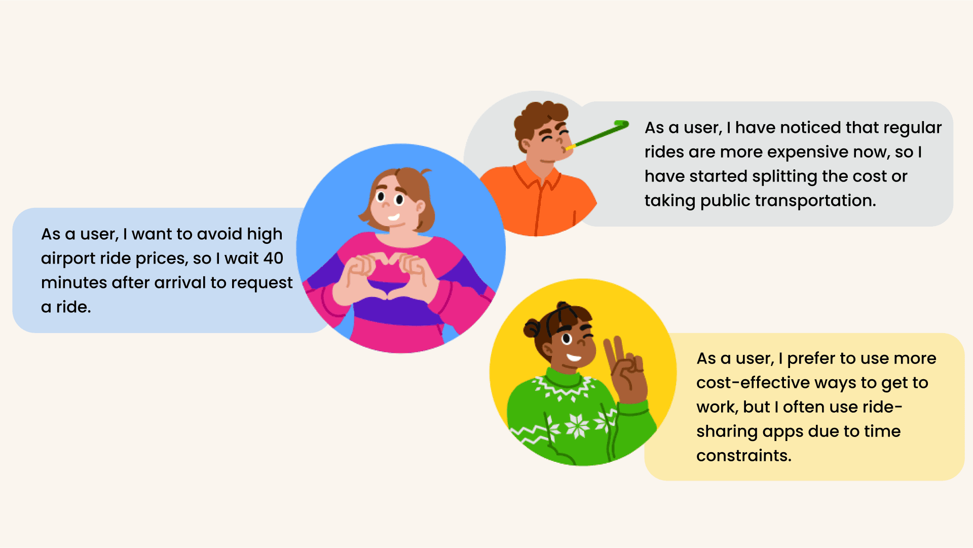
Based on the research insights obtained, the user personas fall into three distinct user categories:
Ride to the Airport: To avoid high airport ride prices, users wait 40 minutes after arrival to request a ride.
Commuting to work: Users prefer to use more cost-effective ways to get to work, but they often use ride-sharing apps due to time constraints.
An occasion for socializing: The user has noticed that regular rides are more expensive now, so they have started splitting the cost or taking public transportation.
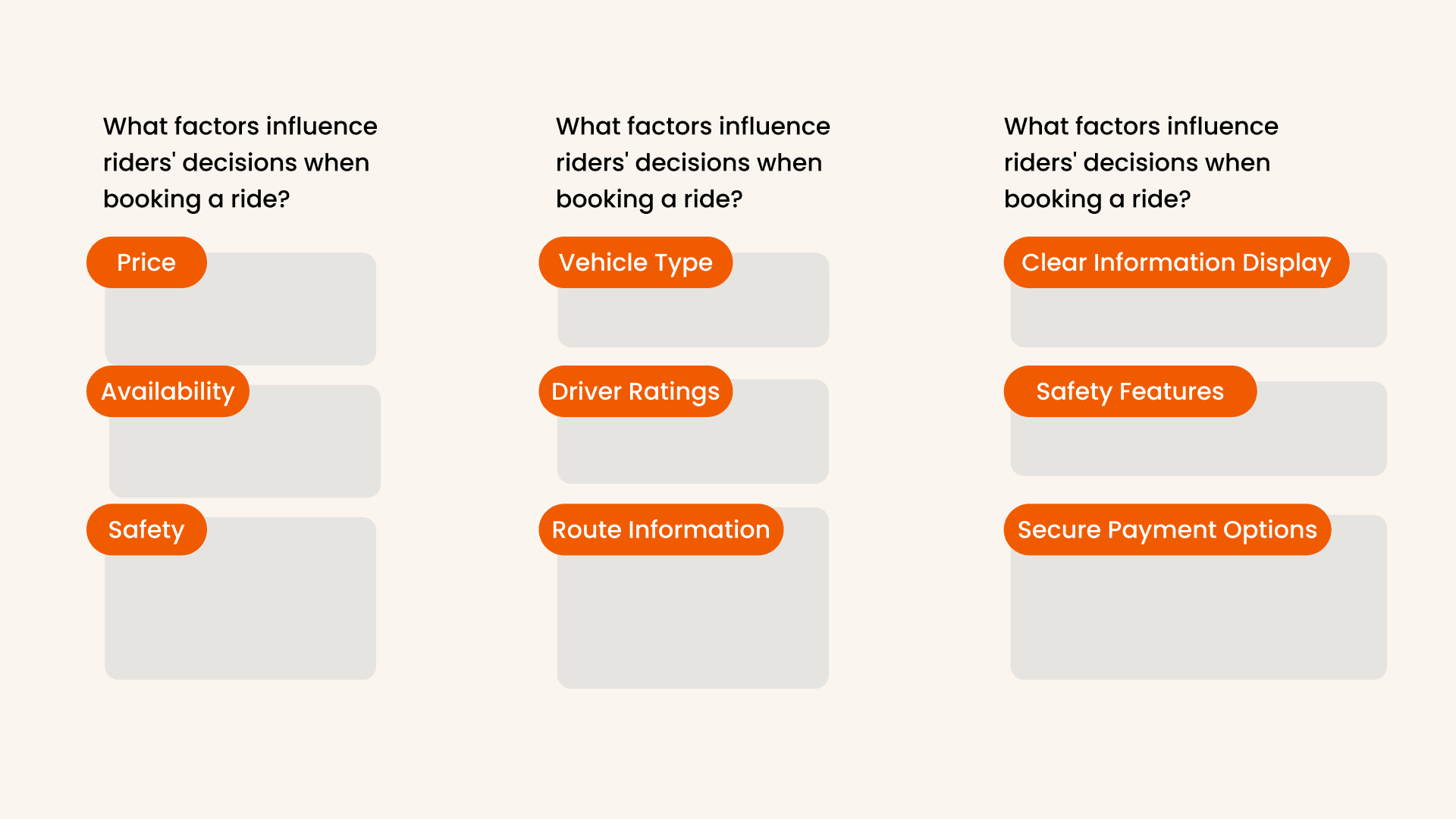
I Conducted Competitive Analysis to Uncover Trust-Building UI Components
with my extensive research data collected, I develop Competitive analysis plan and went trough different ride-sahring app with the focus to respond to these questions, that help identify small components that make up the user- mental model in the rider experience.
What factors influence riders' decisions when booking a ride?
Which components riders consider when booking a ride?
Which UI components are being implemented to increase trust?
I Initiated Design and Ideation with Problem Statement Definition and Creative Exercises
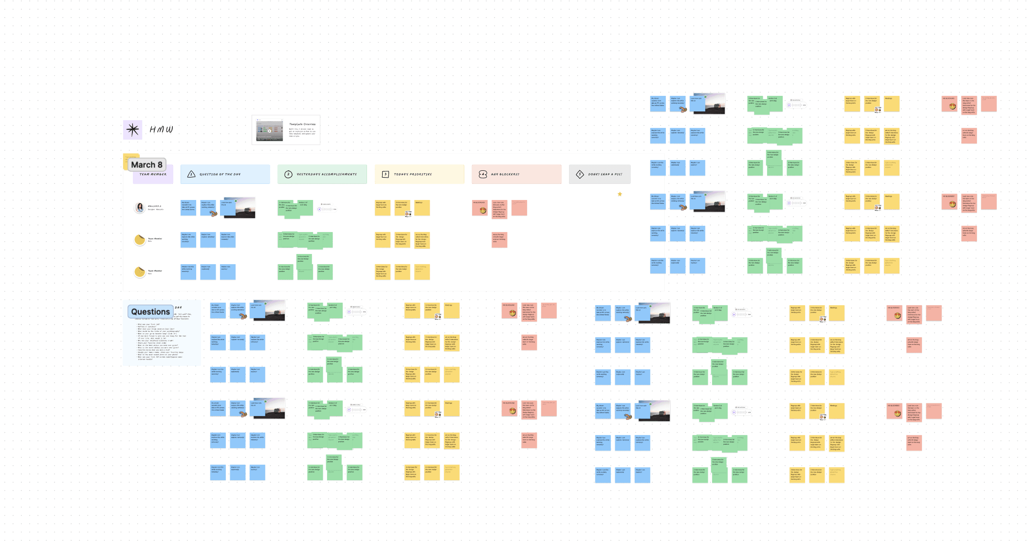
I began the design and ideation process by clearly defining our problem statement. To foster creative thinking and generate innovative solutions, we conducted "How Might We" exercises and engaged in "Crazy 8s" exercises. These activities helped us brainstorm various ideas to address the challenges faced by the industry and the decision-making problem.
How Might We Exercise: The "How Might We" exercise allowed us to reframe problems as opportunities. We focused on questions like:
How might we make rides more affordable for users?
How might we increase trust between riders and drivers?
How might we improve the overall user experience?
Selected Ideas for Exploration
These selected ideas laid the foundation for my design exploration and further development stages, aiming to address the core challenges and enhance the overall user experience in the ride-sharing industry.
I Initiated Digital Design with Figma for Streamlined Collaboration
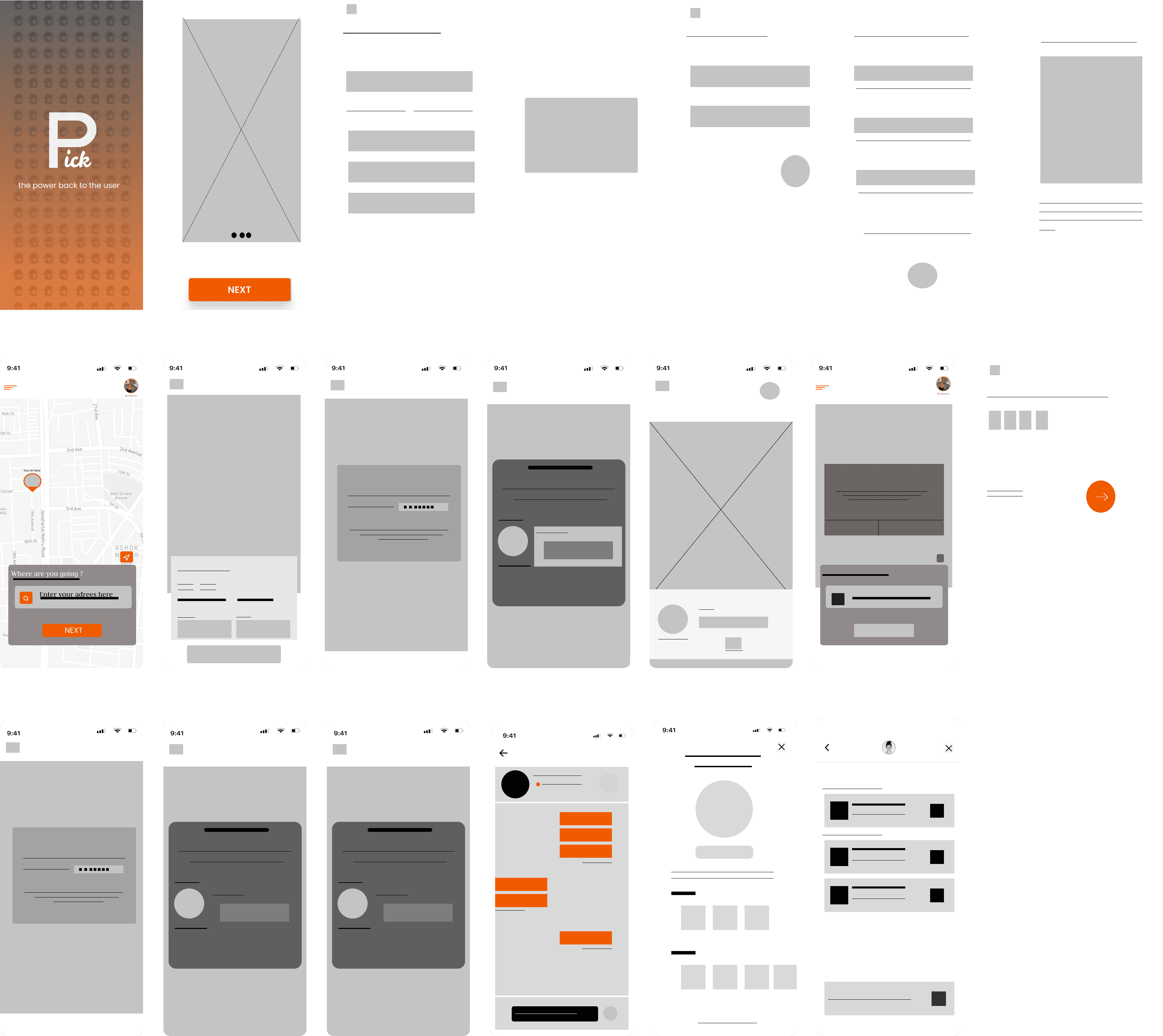
In the initial stages of the design process, I chose to forgo traditional pen-and-paper sketches and instead embraced digital tools, specifically Figma, to create low-fidelity wireframes. This decision was driven by the desire to streamline the design process, facilitate collaboration, and create a more scalable design solution.
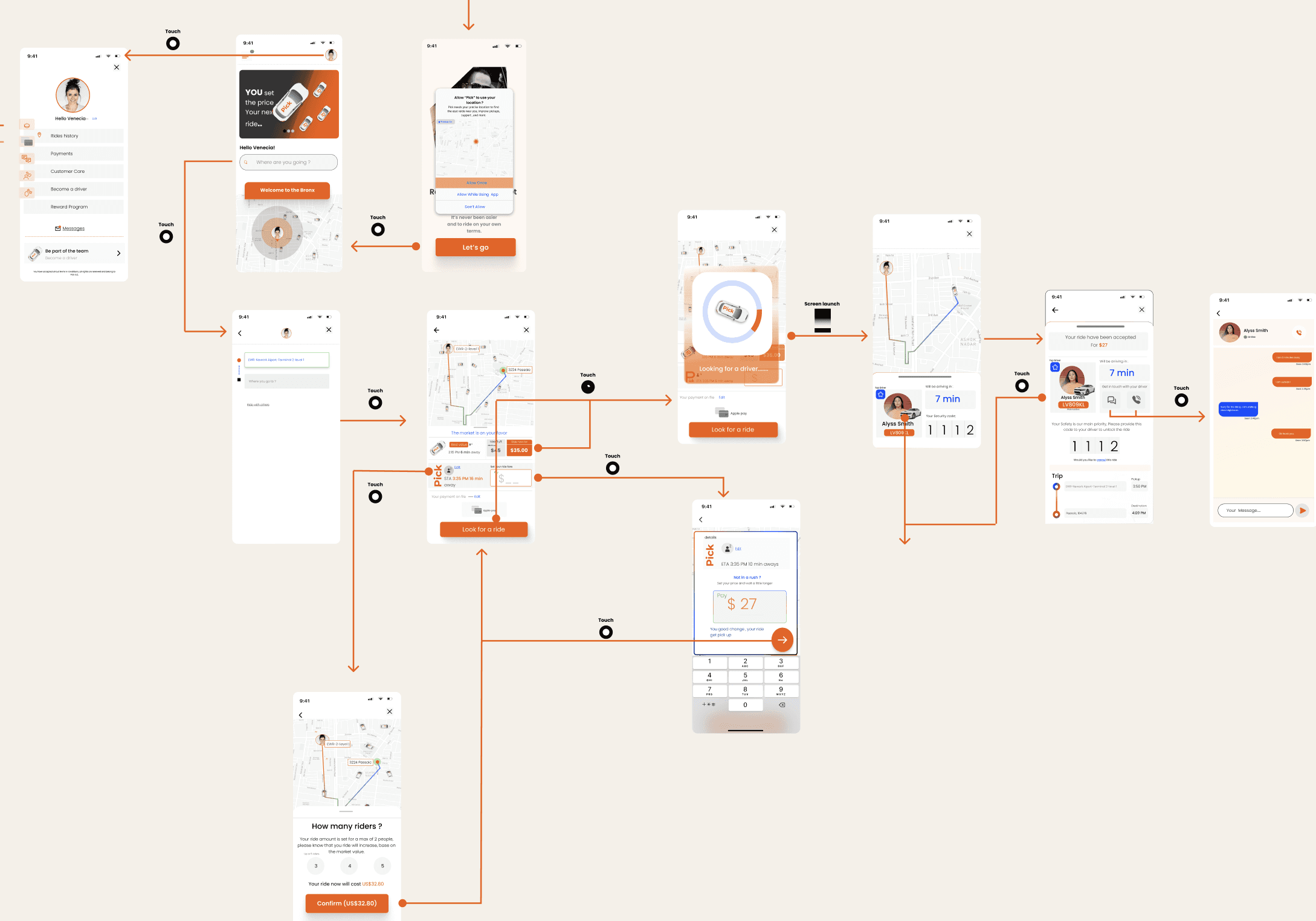
I Defined Interaction Flows and Introduced Gestures for Enhanced Mobile Navigation
Given that this project focuses on a mobile solution, it was crucial to explore and clearly define the different interaction flows between the content of every screen. I identified several gestures to introduce in the design to ensure easy navigation for mobile users. Some of the gestures I decided to incorporate into the design for enhanced mobile navigation are:
Touch Swipe to Expand: Users can swipe on certain elements to expand them, revealing more detailed information or options without cluttering the screen.
Expand, Correct, and Refine: This approach allows users to easily expand sections for better visibility, correct any input or selections, and refine their choices as needed, providing a more intuitive and user-friendly experience
Design for affordability
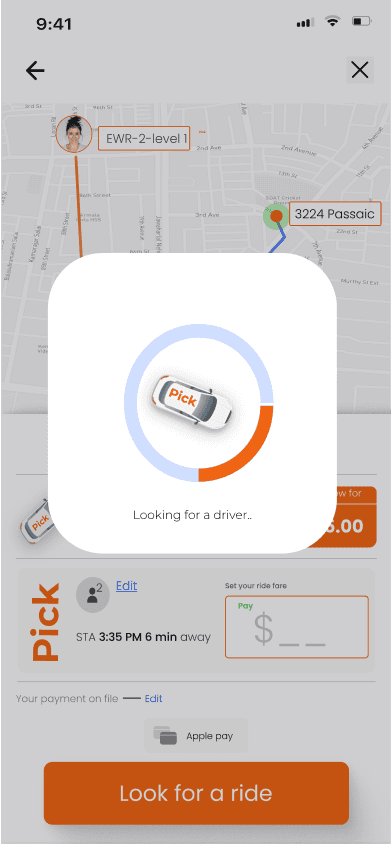
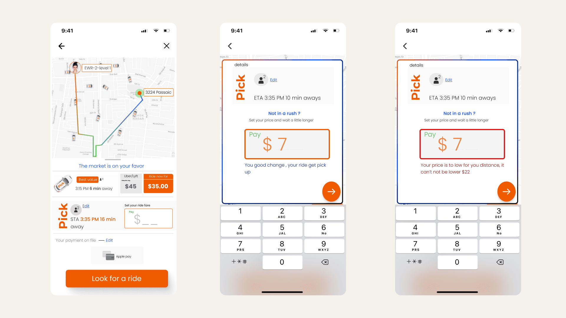
To address these requirements, I initially focused on developing a design system flow. This approach helped us understand how the request and bidding system would be utilized by users and ensured that the feature was not abused by users offering unrealistically low amounts.
Design for Trust
Building trust through design was one of the most significant challenges in this project. It required a deep understanding of the user's mental model to create solutions that instill confidence and reliability in the platform.
Key Design Strategies for Trust:
Transparent Pricing Comparison:
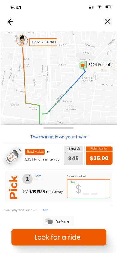
On the landing page, I designed a price comparison feature to show users the competitive rates in the market. This provides users with a point of reference, helping them make informed decisions and trust the platform's pricing.
Detailed Driver Card:
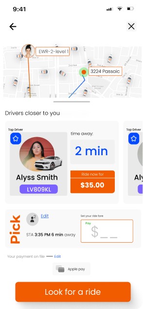
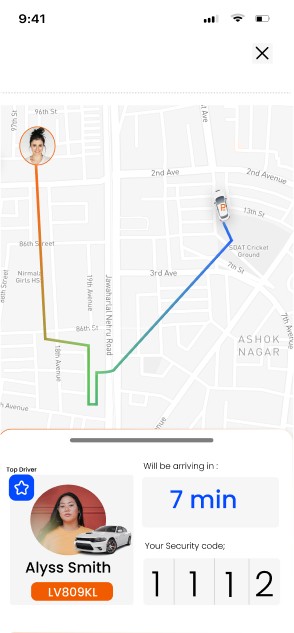
After booking a ride, I devised a driver card that displays all essential information about the driver. This includes the driver's name, photo, vehicle details, and ratings, enhancing transparency and fostering trust.
Pin-Unlocked Rides:
To ensure security and authenticity, I introduced a pin-unlocked ride feature. Users receive a unique pin that they must provide to the driver to start the ride, adding an additional layer of verification and safety.
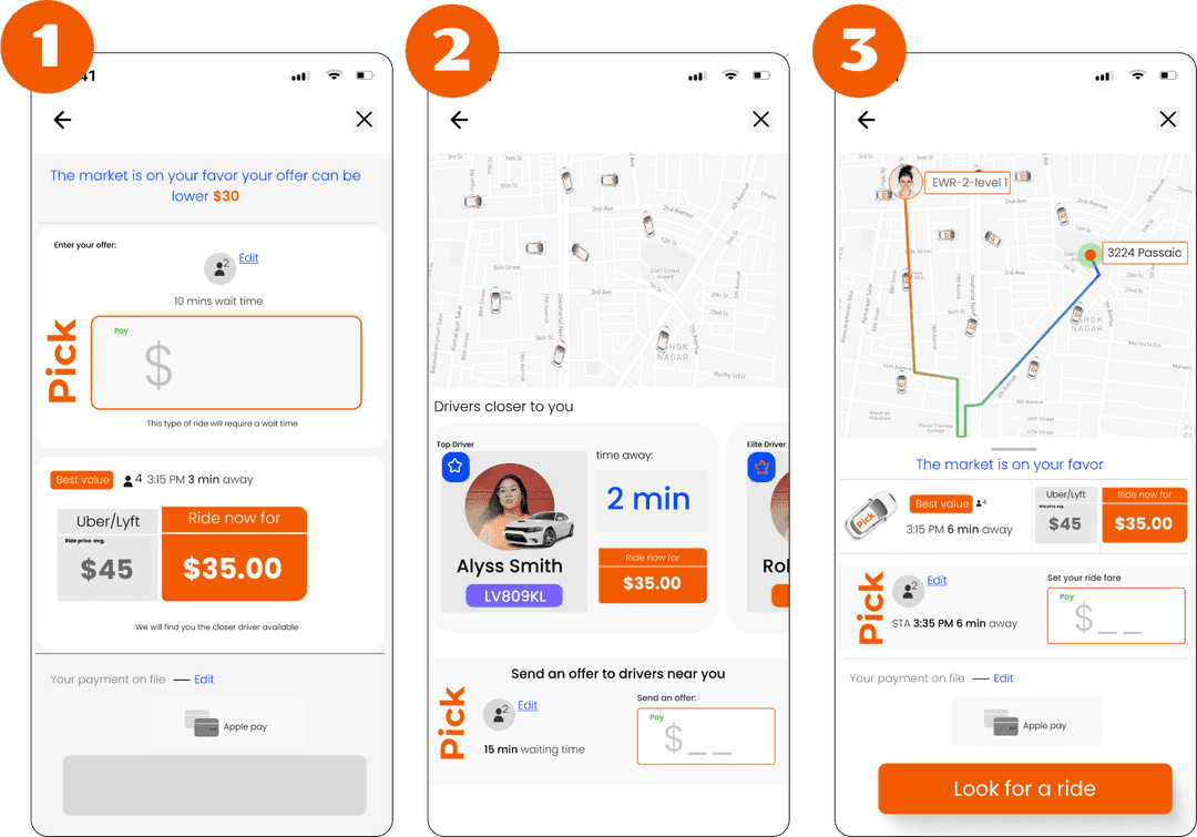
I Iterated Through Various Solutions and Implemented User-Centric Expansion.
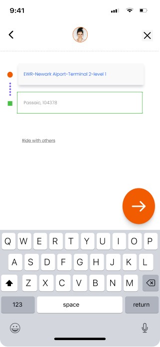
During this project, iteration was a critical and ongoing task as we learned more from the users and received additional requests from the cross-functional team. Due to the dynamic nature of the project, I won't be able to showcase all the iterations that led to the final design. However, one of the significant challenges we faced was aligning on how the request rider page should look and serve as the entry point for the two features we are offering to users.
How Might We Exercise: The "How Might We" exercise allowed us to reframe problems as opportunities. We focused on questions like:
How might we make rides more affordable for users?
How might we increase trust between riders and drivers?
How might we improve the overall user experience?

