Tablet's Settings
What I did
Stakeholder
involved
Overview
Task
Simplify tablet settings to increase findability rate.
TL:DR
Aim: Simplify settings navigation on Android tablets for better user experience.
Research Insights: Information architecture, gap analysis, and behavioral data.
Developed micro-interaction concepts to streamline settings.
Introduced Color Zone diagram for effective communication.
Conducted workshops for cross-functional collaboration and proposal refinement.
Emphasized understanding design systems and prioritizing end-user involvement.
Declutter and organize.
Save time.
Allow user to troubleshoot more intentional.
Increase findability rate.
Increase user-generated satisfaction.
Increase System maintainability.
I discovered and defined opportunities for simplifying tablet settings
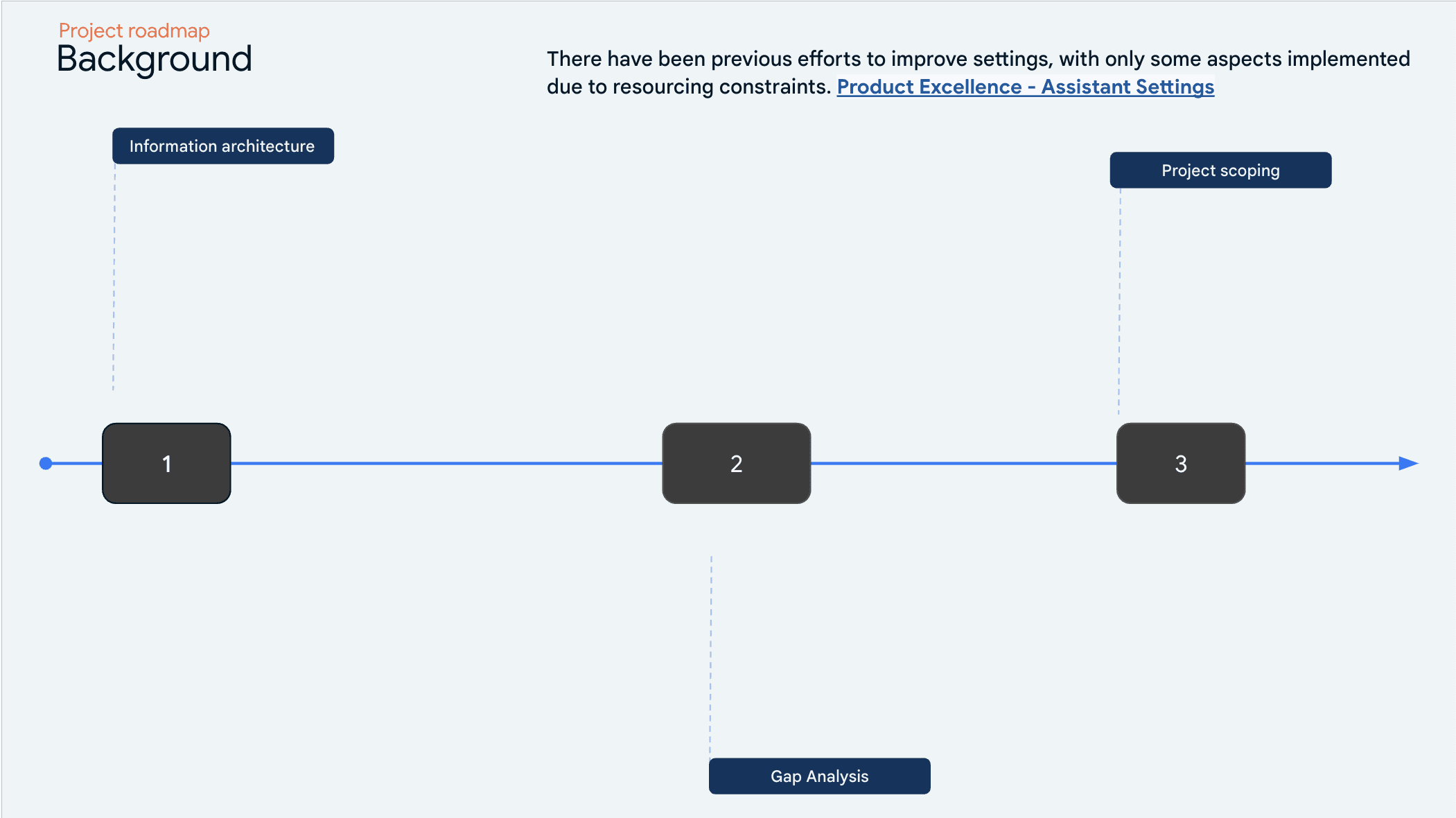
The task of simplifying settings for the tablet experience comes with a lot of ambiguity and unclear paths. My first action was to create a project roadmap to help identify different pain points in the experience, with the goal of aligning with stakeholders and other team members on where to focus.
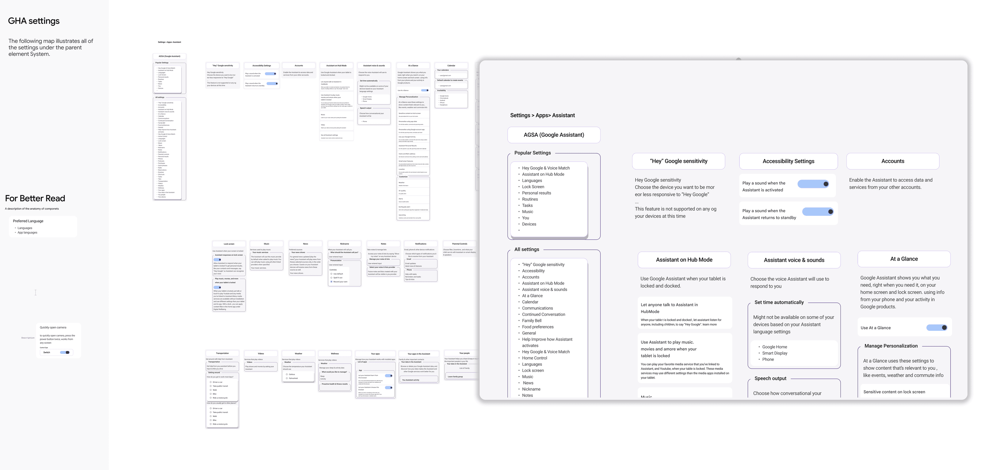
Aligned with stakeholders and other peers, the first step was to create the information architecture for the three main pillar products: Android operating system, Google Home app, and Google Assistant, as there was no such artifact previously created.
Secondly, I conducted a gap analysis to identify key areas for improvement in tablet settings. This involved comparing with other operating systems and diving into obtaining data such as success rate, click rate, and findability rate.
By the final stage of project scoping, I aligned with the cross-functional team to determine which solutions to focus on for an effective launch in the summer.
I Unveiled Complex Nesting Structures in Settings: Insights from Information Architecture Analysis
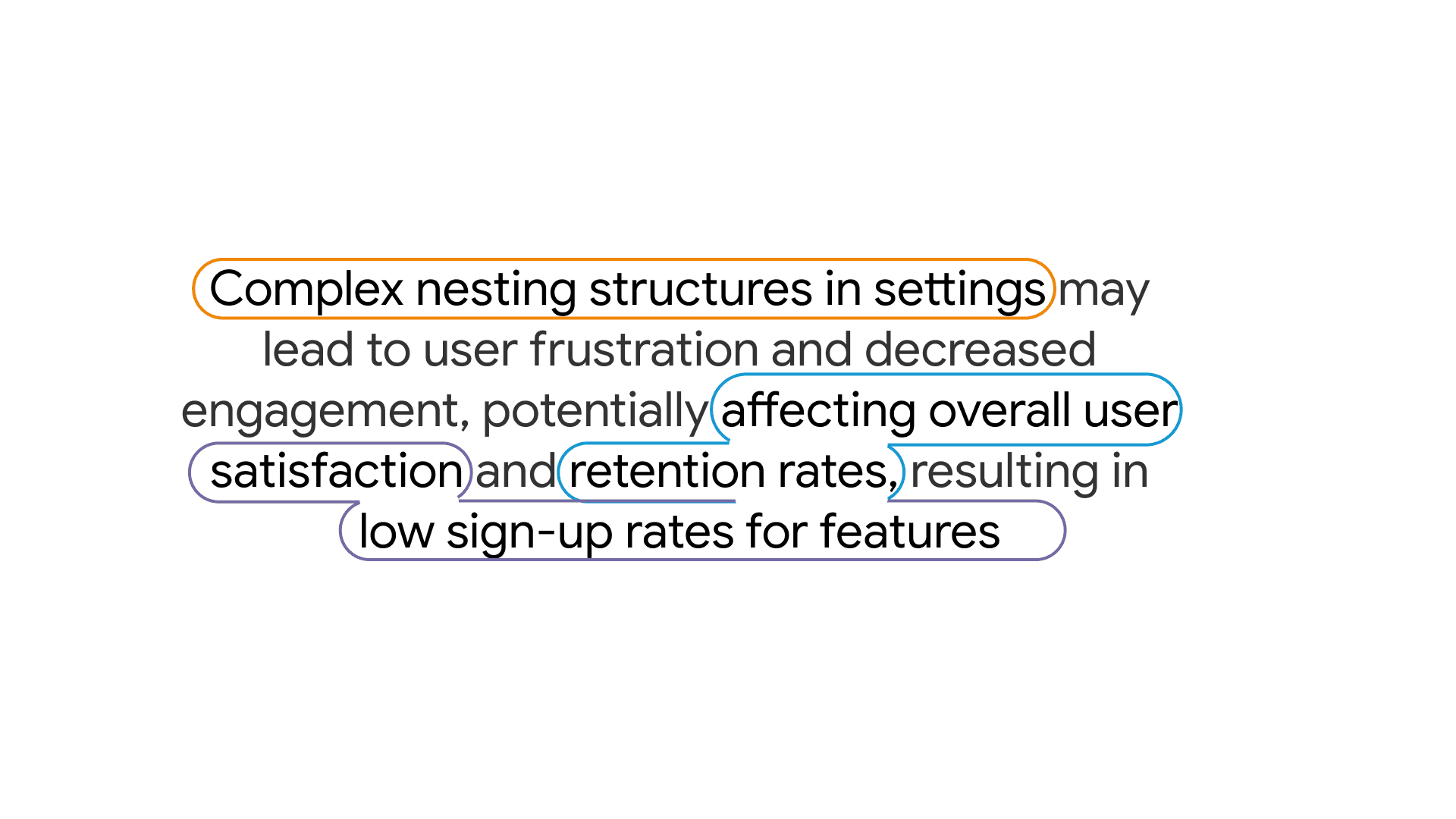
As a result of the information architecture I created and analyzed, I found early insights into the nesting relationships across settings and identified duplications. This refined my initial hypothesis, prompting further exploration supported by collecting user insights. "Complex nesting structures in settings may lead to user frustration and decreased engagement, potentially affecting overall user satisfaction and retention rates."
I Utilized Previous UXR Insights to Illuminate User Experience: Discoveries and Validation
I collected previous uxr insights to better understand the current user experience. From this phase, I discovered that nesting relationships were not the only issue users were facing. I found that only xx out of 300+ settings screens are seen by users during the initial setup. This means many features remain undiscovered and unutilized, presenting another opportunity for exploration. This insight provided validation for my refined hypothesis.
I Investigated User Navigation Challenges: Insights from Data Analysis
Following my planned hypothesis and early collected user insights, I wanted to explore user behavior from a data viewpoint. I partnered with the data team to request different sets of data for analysis, such as click-rates and sign-up rates. This helped me understand the top settings users engaged with and the paths they followed to get there.
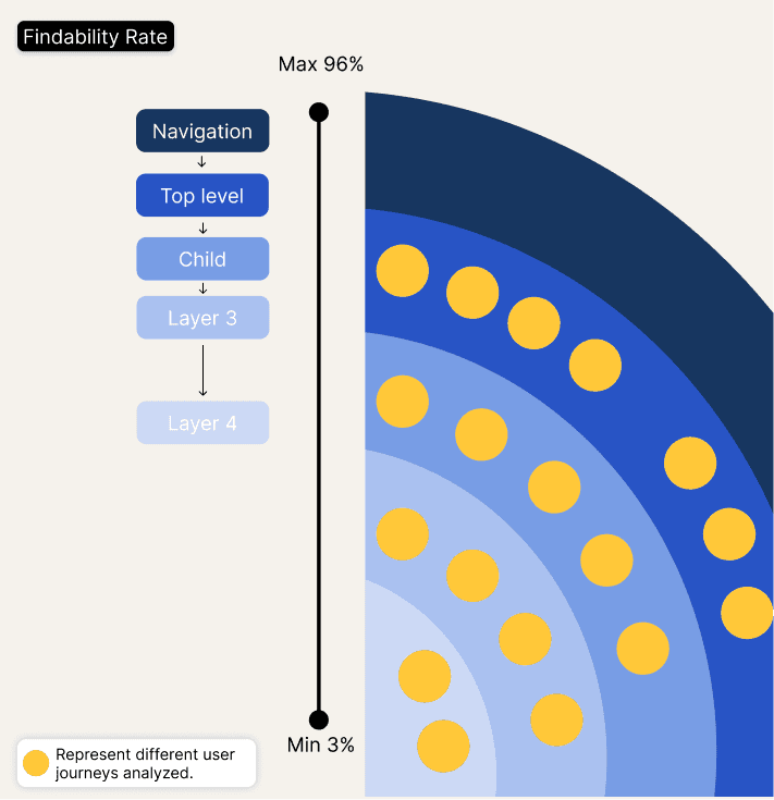
I analyzed over 20+ user navigation paths and created a visual artifact to communicate that most actions in Android settings require 2+ taps to accomplish the goal. The deeper users go, the findability rate decreases, making it challenging for users to learn the navigation path or causing them to give up on the experience.
I Spearheaded the Design Phase Through Interaction Pattern Exploration and Hosted a Workshop with a Cross-Functional Team for Alignment.
The proposal I presented would involve different settings teams across the organization and would require additional time and an increased budget. Given these considerations, the decision was made to partner with a smaller team initially to work on their settings framework. This approach allowed us to introduce the framework, collect data, and create a stronger proposal to push the concept forward across devices and apps.
I Delved into Interaction Pattern Exploration to Enhance Design Consistency
I began my ideation phase by exploring different interaction patterns that align with the design system in settings. Some of the interaction patterns I explored included tap to disclose, tap to expand, swipe gestures and long-press actions
I Orchestrated a Workshop for Collaborative Design Enhancement
Right after, I started to analyze how different user journeys could be simplified by using these different interaction patterns. I hosted a workshop with program managers and different settings designer owners to identify and discuss how these patterns could be implemented in their settings to simplify the user navigation path. During this workshop, I collected requirements and fostered partnerships to collaborate.
After Gaining Alignment, I Collaborated with the Android Settings Team to Refine Concepts
After several meetings with senior stakeholders and obtaining multiple feedback points, I gained alignment to move forward with three concepts. I partnered with the Android settings team to refine these concepts and explore how they could fit into the project roadmap. This partnership was crucial; with their assistance, the solution will have a more significant impact within the organization by being delivered to users not only on Pixel tablets but also across the broader device ecosystem.
I Spearheaded the Development of 'Discovery Center': A Quick Entry Point to Settings
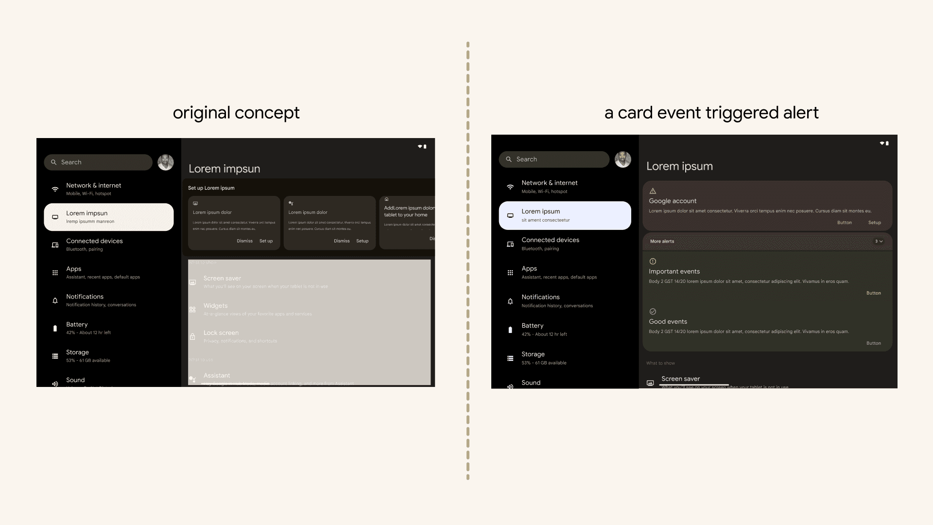
The original concept was designed to provide users with a quick entry point to settings that were skipped during the sign-up process, aiming to increase feature sign-up rates and usage. However, this initial concept was shelved due to a similar project within the settings team. Instead, it evolved into a card event triggered alert that informs users about the importance of specific settings. This approach educates users about the significance of enabling certain settings, emphasizing their importance.
Benefits:
User Engagement: Encourages users to revisit and enable skipped settings, enhancing their engagement with the platform.
Increased Feature Adoption: Prompts users to explore and utilize features they might have missed during the initial setup.
Educational: Provides valuable information and context about the importance of specific settings, educating users on their functionality.
Improved User Experience: Offers a seamless way to review and adjust settings without disrupting the overall user experience.
Enhanced User Satisfaction: By ensuring users have access to and understand essential settings, it contributes to overall satisfaction with the product.
I Explored 'Tap to Expand' as a Solution to Optimize Nested Settings Navigation
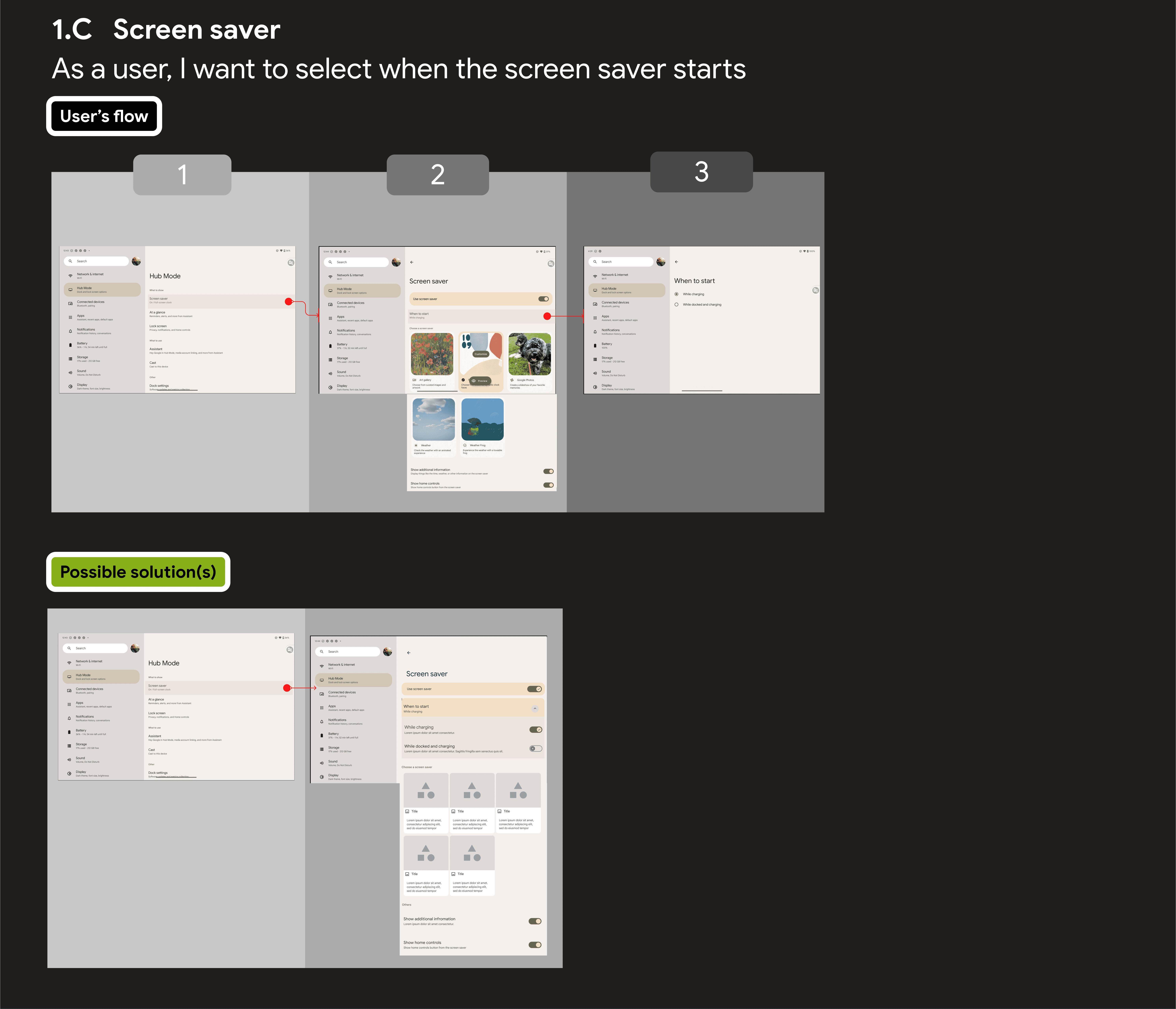
Tap to expand is a solution for optimizing nested relationships between settings by reducing the CUJs' navigational path to increase findability rates within settings
Benefits:
Simplifies navigation by reducing the number of taps required to access nested settings.
Maintains context by allowing users to expand settings within the current view.
Enhances findability rates within settings, making it easier for users to locate specific options.
Improves user experience by streamlining the interaction process.
Increases efficiency by reducing the time and effort needed to access and adjust settings.
I Navigated Constraints: Stakeholders, Time, and Scope
Adapting to constraints during the development of this project was essential. I had to adjust to multiple constraints, including stakeholders, time, and scope. Initially, the problem of simplifying settings for tablet users seemed straightforward. However, as the project progressed, we realized it was more complex than anticipated.
The first constraint was aligning on what to prioritize, focusing on solutions that could scale later. The second constraint arose when the initial concept of the Discovery Center was deemed out of scope after a review by senior stakeholders due to duplication with other projects on the roadmap. This required quick ideation and implementation of feedback, leading to an evolved event-triggered experience.
The last constraint involved the engineering team. Implementing "Tap to Expand" required significant engineering effort to fix all nesting relationships. We aligned on introducing a small framework that would allow for scalability.
Tap to Expand /Discovery Center
"Tap to Expand" was included in the short-term product roadmap, while the Discovery Center was placed on the long-term roadmap
